Woven, Printed or Embroidered: Three Ways a Club Mark Appears on Fabric
Compare a woven, printed or embroidered club mark by its texture, edge and bond with the garment, then choose the finish that suits its fabric and feel.
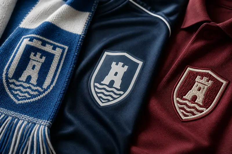
A woven, printed or embroidered club mark can make the same shirt feel like three different objects. Look closely at the surface: one design is formed from threads, one sits as a layer of colour, and one rises above the cloth in stitched relief. For a supporter choosing a scarf, shirt or training top, those differences matter more than a general claim that one finish is superior.
The useful question is not simply which mark looks most polished. It is how the emblem meets the garment: whether its edge is crisp or softened, whether the cloth remains flexible beneath it, and whether the finish belongs with the item’s intended use. These clues help explain why a flat, detailed mark may suit one piece while a tactile crest feels more at home on another.
Woven marks make the design part of the cloth
A woven mark is created as the fabric itself is made. Differently coloured threads form the image, so the emblem is not merely placed on top of a finished garment. On a scarf, a jacquard-style weave can carry a badge, lettering or a repeating motif through the same structure as the surrounding material.
Its surface usually feels continuous, though the design may have a subtle relief where the weave changes. Turn the fabric over and the reverse often gives a useful clue: coloured threads and small floats can show how the image is built. The exact appearance depends on the weave and the yarn, so the back may look less tidy than the front without suggesting poor workmanship.
Edges in a woven design are governed by the scale of the threads and the geometry of the weave. Curves can appear stepped or slightly block-like, particularly where a small motif has fine lettering or narrow outlines. Broad shapes and clear colour fields tend to sit naturally within the fabric’s grain.
This makes woven marks a natural fit for scarves, knitted accessories and other pieces where the emblem can share the textile’s texture. They also suit designs that benefit from being visible on both sides, though reverse-side legibility varies. A fine, intricate crest may lose some of its detail at the scale the weave can reasonably hold.
For a scarf, inspect whether the mark is woven into the material or carried on a separate label sewn over it. Both can be well considered, but they create different relationships with the cloth: one continues across the surface, while the other introduces a distinct patch.
Printed marks keep the surface comparatively flat
A printed mark applies colour to the fabric rather than building it from the cloth’s threads. Depending on the printing method, the ink may sit close to the surface or form a more noticeable layer. In either case, the design can retain fine lines and smooth curves without the visible stitch paths of embroidery or the stepped forms sometimes found in woven lettering.
That clarity is useful for a complex crest, small lettering or a design with several closely spaced colours. A print can also feel visually quiet: the eye reads the emblem, while the hand may notice little change in texture. On a lightweight training top, that restrained surface can preserve the garment’s soft, flexible character.
The edge is often the most revealing feature. A well-defined print can have a clean outline, while a softer application may blend slightly with the fabric’s texture. If the material stretches, the mark’s appearance can shift with it; the garment and printing process together determine how readily the surface flexes.
Printed marks can suit casual tops, performance garments and designs that rely on small details or smooth colour transitions. They are less about added relief and more about a close visual relationship with the garment’s face. A print that looks crisp on a flat display may read differently once the cloth gathers around a seam or moves across the body.
Check the mark on the garment as worn, not only as a graphic on a product page. A crease, curve or stretch can reveal whether the print remains visually calm or becomes a prominent surface layer.
Embroidered marks bring stitch and relief
Embroidery forms a mark with thread stitched onto a finished fabric. The threads create a raised surface, and the direction of the stitches can give the emblem a changing sheen as it catches light. Even a simple badge gains a tactile presence that is easy to recognise by touch as well as sight.
Its edge is shaped by the path of the stitches. Outlines can feel firm and deliberate, while tiny letters or narrow gaps may become crowded if the design is reduced too far. The thread also establishes a visual rhythm: satin stitches can make a smooth band, while other stitch patterns produce a more visibly textured fill.
Embroidery suits heavier shirts, jackets, caps and garments where a defined crest feels in keeping with the fabric. It can give a badge a sense of substance without requiring a separate woven patch, though some garments do use an embroidered emblem on a backing. That backing may affect how the mark feels against the skin or how the cloth bends beneath it.
On a fine or stretchy fabric, dense stitching can create a firmer area than the surrounding material. This contrast may be welcome on a structured chest panel and less comfortable on a soft, close-fitting top. Consider not only the emblem’s front but also the reverse, where thread ends or backing can be noticeable.
Embroidery is not automatically more refined because it has dimension. Its raised edge and stitch texture are part of its character; they can complement a substantial garment, but may compete with a very light fabric or a delicate design.
Which fabric mark suits the garment?
Which finish keeps a scarf’s design in the fabric?
A woven mark can make the emblem feel continuous with a scarf, especially when the design uses bold shapes and a limited set of colours. A sewn-on badge instead gives the scarf a separate focal point, while embroidery adds a raised patch of texture.
Which finish holds fine lettering most clearly?
Printing is often the most straightforward option for small lettering and closely detailed artwork because the image need not be translated into individual woven blocks or stitch paths. The final clarity still depends on the fabric’s texture and the application method.
Which mark feels most substantial?
Embroidery usually offers the clearest relief under the fingers, with thread that stands above the cloth. Woven texture can also be tactile, but it remains part of the fabric’s construction; printing is generally flatter, though some applications create a noticeable coating.
Can a club mark combine these finishes?
Yes. A garment might carry a printed emblem on its body and an embroidered badge elsewhere, or use a woven label as a secondary detail. The result works best when the contrast appears deliberate, rather than as though the same mark has been repeated without regard for the fabric.
Choose by edge, texture and garment behaviour
Start with the garment rather than a favourite finish. A scarf invites a different relationship with its emblem from a lightweight top: one can carry a design through the cloth, while the other may benefit from a flatter surface that follows its movement.
- Read the edge. Woven outlines may follow the weave’s grid; printed outlines can remain smooth; embroidered outlines are defined by the stitch path.
- Feel the surface. Decide whether you want the fabric’s own texture, a relatively flat application or raised thread.
- Consider the reverse. Woven thread floats, print transfer or embroidery backing can change how the inside looks and feels.
- Match detail to scale. Fine lettering may favour print, while broad shapes can work well as weave or stitch.
- Notice the cloth’s movement. A firm emblem on a fluid garment creates a different impression from a mark that bends with the surrounding fabric.
Say you are choosing between a soft supporters’ scarf and a light training top, both carrying the same shield. On the scarf, a woven version could echo the textile’s grain and make the design feel integrated; on the top, a flat print could preserve a quieter surface as the cloth moves. The expected visible difference is a textured, thread-built badge on one item and a closer, smoother colour field on the other—not a claim that either is inherently better.
Labels, care instructions and manufacturer guidance can clarify how a particular mark is made and maintained; follow them where the finish or garment calls for specific handling. If that information is unavailable, the visible edge, the reverse and the way the fabric drapes still offer useful clues.
When comparing a woven, printed or embroidered club mark, ask which relationship you want between emblem and cloth: shared structure, applied colour or stitched relief. That decision makes the mark feel like part of the garment’s design, rather than an isolated badge chosen by habit.