Why a Crest Must Read at a Glance
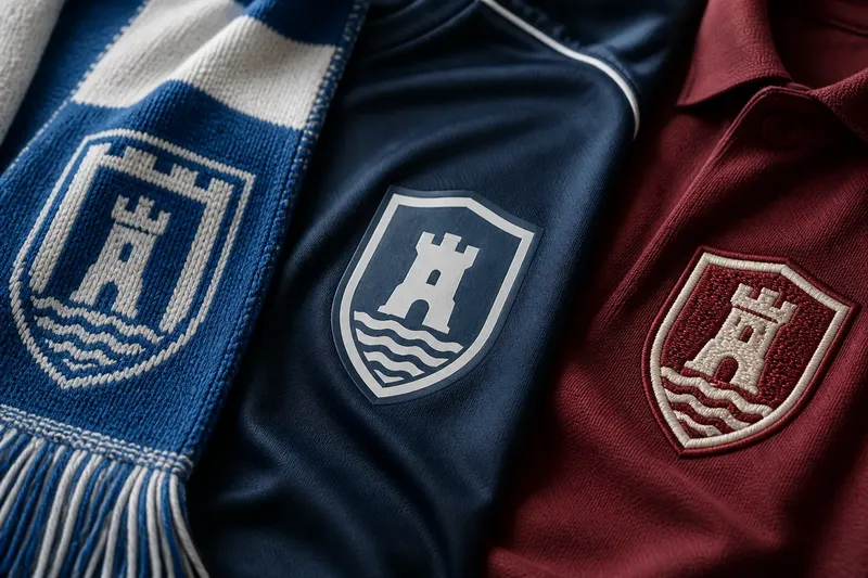
A sporting crest that reads at a glance stays recognisable on a phone, scoreboard or shirt by relying on a clear silhouette, strong contrast and few cues.
How can a sporting crest stay recognisable when it shrinks from a screen graphic to a tiny badge? The answer lies less in adding detail than in deciding which shape and visual cues should survive. A crest that reads at a glance gives the eye a clear outline, a firm contrast and a small set of features to remember.
That question matters because a club mark appears in many contexts: beside a fixture on a phone, on a scoreboard, in a social post and across the chest of a shirt. Each setting changes its scale and surrounding clutter. The task is not to make every detail equally visible, but to make the identity legible before the viewer has time to study it.
Start with the outline, not the ornament
A silhouette is the outer shape perceived before a viewer can distinguish internal lines, lettering or symbols. A shield, roundel, pennant or unusual combination of forms can all create a memorable boundary. None is automatically better; the useful question is whether the boundary can be recognised when its interior is simplified or obscured.
Try viewing the crest as a single dark shape against a plain background. If its contour still feels distinctive, the design has a strong first cue. If it could belong to many clubs, consider whether a notch, taper, crown, curved base or other feature already present in the design can make the outline more specific without turning it into a jumble.
Silhouette should not be confused with complexity. A familiar shield can carry a distinctive profile through a carefully chosen top edge or base, while an elaborate outline may become a noisy patch at small size. The boundary needs a clear rhythm: broad areas should remain broad, and small projections should not disappear into neighbouring parts.
For a quick check, fill the crest with one colour and reduce it on screen. Notice what remains, rather than mentally supplying details you know are there.
Choose a few cues the eye can hold
Inside the outline, a crest often contains several possible identifiers: a ball, animal, tower, tool, letter, local emblem, founding reference or band of colour. These details may each have meaning, but a small display cannot give them equal attention. Choose a primary cue, then decide whether one or two supporting elements help identify the club rather than merely fill space.
A useful cue has a clear shape and a distinct position. A ball placed above a central band, for instance, is easier to remember as a relationship than as a collection of fine marks. Repeated elements can also form a recognisable pattern, provided they do not dissolve into visual texture when reduced.
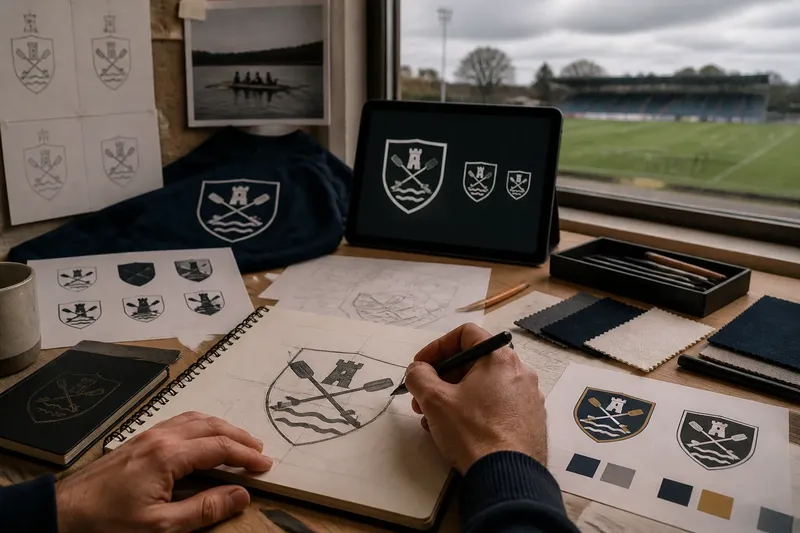
Imagine a fictional rowing club whose crest contains a narrow boat, crossed oars, a river line, a local tower and several initials. If the club wants the oars and river to carry its identity, it could make those forms dominant and let the tower become a simple block. At small size, the expected result is that viewers notice a clear crossed shape and horizontal line before trying to decipher the initials.
Meaning and legibility are related but not identical. A symbol can matter deeply to members yet be difficult to parse in miniature. Retaining its position or broad shape may preserve the association while leaving fine internal detail for larger versions.
Use contrast to separate neighbouring forms
Contrast is the difference that lets one part of the crest stand apart from another. It can come from light and dark values, colour, a solid shape against an open field, or a clear gap between two elements. When adjacent parts share similar tones and touch, their boundaries can merge, especially on a small or low-quality display.
Check the mark in colour and in plain black and white. This does not mean the official palette must be abandoned; it reveals whether separation depends entirely on a particular pair of colours. If two regions collapse into one, a stronger value difference, an outline or a deliberate gap may clarify their relationship.
Contrast also sets hierarchy. A bright detail can draw the eye away from the central symbol, while a dense dark area may make the whole crest feel heavier on one side. Ask what should register first, then adjust the surrounding shapes so they support that order.
Look at adjacent areas, not just the palette swatches. The boundary between forms is where recognition is either helped or lost.
Test the crest across real viewing sizes
A crest may look convincing on a large design board and fail beside a fixture list. Test it at the sizes and in the settings where people encounter it: a small phone icon, a broadcast graphic, a scoreboard, a website header and a larger printed presentation. The exact viewing conditions differ, so use the actual artwork and check what remains visible rather than relying on a zoomed-in preview.
At the smallest size, look for features that close up: thin gaps, tiny lettering, narrow outlines and small counters inside letters or symbols. A counter is the enclosed space within a character such as “O” or “A”. When that opening fills in, the letter can become an unrecognisable patch.
At a larger size, check that simplifying the design has not removed the relationships that make its symbols meaningful. A boat and oars might need enough separation to read as separate objects; a single stripe may need to remain clearly attached to the shield rather than floating in it. Small-scale clarity should come from deliberate structure, not from accidental loss.
Use versions only when they serve a real viewing need. A compact mark can omit small lettering or secondary ornament while retaining the same outline, dominant cue and colour logic. The larger version can carry more detail, but it should still feel like the same crest rather than a different design.
A short review can reveal what needs to change
Rather than revising every part at once, review the crest in a deliberate sequence over a short design cycle. Each pass should answer one question, so a change to contrast does not obscure whether the silhouette was doing its job.
- First pass: isolate the shape. View the crest as a single-colour silhouette on a plain field. Note the one feature that distinguishes its outline, and flag any contour that looks accidental.
- Second pass: name the main cue. Look at the full-colour mark and say what should register first. If several symbols compete, choose the one that best carries the club’s identity and reduce the visual weight of supporting details.
- Third pass: inspect separation. Convert a working copy to black and white. Look for touching forms that merge, then consider changing their value, spacing or outline.
- Fourth pass: shrink the artwork. Place it beside a fixture or score graphic at a realistic small display size. Note which letters, gaps or symbols disappear and decide whether they are essential at that scale.
- Fifth pass: check the fuller version. Return to a larger view and ensure the simplified cues still relate correctly. Restore detail only where it adds meaning without weakening the visual order.
Say a fictional futsal club reviews its crest during a week of design meetings. On the first pass, its shield silhouette remains clear, but the tiny initials disappear when reduced; the club decides to keep the initials for larger applications and rely on a distinctive ball-and-arc symbol in compact use. On the next pass, the ball blends into a dark stripe, so the designer opens a narrow gap. The expected observable result is a visible ball shape at small size, while the larger crest still carries the club’s lettering and full arrangement.
Which details should survive at small size?
Should a crest include its founding year?
Include it when the date has a meaningful role and remains readable at the intended size. If it becomes a row of indistinct marks in a small icon, keep it for a larger presentation rather than making it compete with the main symbol.
Do initials make a crest easier to recognise?
They can, especially when the letters are distinctive and arranged clearly. They can also crowd a symbol or become difficult to distinguish when reduced, so judge the actual letterforms at the sizes viewers will encounter.
Does a simple crest have to be plain?
No. Simplicity is a matter of hierarchy, not a ban on ornament. A crest can include rich detail if its outline and leading cue remain clear before the viewer examines the finer marks.
When should a club make a compact version?
Consider one when the standard mark repeatedly loses lettering, gaps or small symbols in a real display context. Keep its most recognisable outline and cue consistent so the compact version remains visibly related to the full crest.
Recognition depends on what the eye meets first
A crest does not need to tell its whole story in every setting. Its first job is to offer a recognisable form; the finer associations can emerge when the viewer has more room and time. That order respects both the club’s meaning and the practical limits of a small image.
For anyone refining a sporting crest, the useful question is not how many details can fit, but which few should arrive first. A strong silhouette, separated forms and a small number of well-placed cues give the eye something to hold onto. Check those elements at the smallest real use, and the mark is more likely to remain itself wherever it appears.