The Myth That Every Sporting Outfit Must Match
A sporting outfit need not match from head to toe. Use colour, repeated details and deliberate contrast to make a kit feel coherent and individual.
Does a sporting outfit have to match from head to toe to look considered? Not at all: a sporting outfit can feel coherent through a shared colour, a repeated detail or a deliberate contrast, even when its garments come from different sets. The useful question is not whether every piece belongs together on a catalogue page, but whether the combination gives the eye a clear place to settle.
Let one colour do the connecting
When a shirt, shorts and socks are all the same strong colour, the result can look orderly, but it can also flatten the silhouette. A single recurring colour often does enough work. A navy shirt, pale shorts and navy socks form a readable combination without turning the wearer into one unbroken block.
Look for a colour that already has a reason to be present: a narrow stripe on the shirt, a cuff, a number or a small detail on the footwear. Carrying that colour into one other garment makes a connection the eye can notice without making every item identical. The repeated tone may be exact, or it may be a close neighbour; either can feel intentional if the rest of the outfit stays calm.
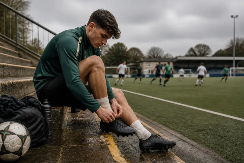
Say you have a dark green training top with a fine cream edge and plain black shorts. Cream socks could pick up the edge, while black remains the quieter base. The expected visual result is a small bridge between the top and the socks, rather than a demand that every item share the same colour.
Choose one linking colour, then let the other pieces support it.
Repeat a detail rather than a whole garment
Coherence can come from shape and finish as readily as from colour. A narrow stripe, ribbed cuff, piping, a simple block of colour or a matte fabric surface can recur in another part of the outfit. Because the detail is small, it lends rhythm without making the combination look like a uniform assembled by force.
Pay attention to scale. A broad shoulder panel on a shirt may pair better with a solid short than with another garment carrying several large panels. A fine stripe can echo a slim sock band; several competing stripes may turn the eye into a search for a pattern. Repetition is most legible when one element is recognisable and the rest leave it room.
There is no need for the details to be twins. A curved seam on one piece and a narrow curved accent on another may share a visual character without matching exactly. This is especially useful when a club or team garment sits beside plain kit, older equipment or a personal layer chosen for comfort.
Use contrast to give the outfit a centre
Contrast is not the opposite of coordination. It is a way to organise attention. A light shirt above dark shorts, or a bright sock against a restrained base, gives the viewer a clear separation between pieces. That separation can make an outfit feel more composed than an attempt to match every shade.
Strong contrast works best when its placement is deliberate. If the shirt carries a large, vivid graphic, a quieter lower half can give it space. If the shirt is plain, a brighter short or sock can provide the accent. The choice depends on what you want noticed first, not on a rule that one garment must always be the focal point.
Consider texture as well as hue. A glossy top beside matte shorts creates a visible change even when the colours are close. That can be a useful distinction, but several sharp changes at once—bright colour, bold pattern and contrasting shine—may leave no clear centre. Keep one contrast prominent and let the others recede.
What makes separate pieces look intentional?
Can different shades of the same colour work together?
Yes, particularly when one shade is clearly dominant and the other appears as a smaller accent. A pale blue shirt with deeper blue socks can read as a related palette; several nearly identical blues may instead look like an accidental mismatch.
Do shoes need to match the kit?
No. Shoes can sit outside the clothing palette, especially when their colour is restrained or already present in a minor detail. For play, fit, grip and the demands of the surface matter more than making footwear complete a colour scheme.
How can a personal layer fit with team colours?
A plain base layer or warm-up top can relate to the kit through one shared colour, or act as a quiet neutral. If it has a strong graphic of its own, let that be the main statement and keep the visible garments around it simpler.
Does every item need the same logo or mark?
No. One visible club or team mark may establish affiliation; repeating several prominent marks can make the clothing feel crowded. Let the mark sit among other visual details rather than treating it as a cue to match every garment.
Account for movement, layering and the setting
A combination does not stay still. During a game, a shirt may lift above the waistband, socks become more prominent in motion, and a jacket may cover the colour that seemed to anchor the outfit indoors. Notice what remains visible when the body bends, runs or reaches, and place the linking detail where it will not disappear beneath another layer.
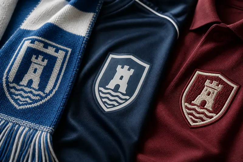
Sporting dress also changes with context. A training session may call for familiar, practical pieces; a club gathering or a day at the ground can leave more room for personal styling. A scarf, cap or warm layer may carry the club colour while the rest of the outfit remains neutral. That is a coherent expression of affiliation without turning every item into team apparel.
Comfort and use come before visual neatness. A garment that restricts movement, catches on equipment or feels wrong for the conditions is not improved by matching the shorts. Fabric weight, fit and the activity itself deserve attention alongside colour. For sport-specific equipment and required dress, follow the relevant manufacturer guidance and local rules.
Read the whole outfit from a short distance
Small details can be persuasive up close and disappear across a court, pitch or changing room. Step back and ask what is visible first: the overall colour balance, one striking item, or a jumble of unrelated accents. This is not a demand for perfect symmetry. It is a way to see whether the pieces have a clear relationship at the distance where they will usually be seen.
A useful final edit is to remove one competing element rather than add another match. If a patterned top, coloured socks and bright footwear all ask for attention, choose which one should lead. The remaining pieces can support that choice through a quiet colour, a repeated line or a simple surface.
The myth that every sporting outfit must match mistakes sameness for intention. A sporting outfit looks considered when colour, repetition and contrast give the pieces a reason to sit together, while leaving enough difference for each to remain itself. Start with one visible connection, then keep the rest of the outfit in service of the activity and the person wearing it.